
SEO-Friendly Website Design Principles
URL structure, information architecture, mobile-first design, performance budget at design stage, and accessibility as an SEO signal — the redesign brief that protects future SEO.
Last updated:

Why design decisions are SEO decisions
You know how redesign projects often come with that dreaded, but predictable, post-launch traffic dip? It’s a common story. A business loses 30-50% of its organic traffic in the first month because critical SEO elements were treated as an afterthought.
Things like URL architecture, schema markup, and internal linking weren’t built into the project from the start.
Our SEO web design service is built on the opposite premise. Since our founding in 2011 by SEO veteran Adam Yong, we’ve operated on the principle that search engine rankings must be tied to tangible business results, and that starts with design. SEO architecture is decided in the brief, before a single pixel is pushed.
Let’s walk through the core principles that need to be locked in before the design phase even begins to ensure your new site is an SEO-friendly website design from day one.
1. URL architecture is a brand decision
URL structure shapes how Google understands your site’s hierarchy and how content authority flows between pages. Getting it right is crucial, as a Backlinko analysis found that keyword-rich, descriptive URLs can have a click-through rate up to 45% higher than generic ones.
Here are three principles to get right:
- Use a clear hierarchy. A logical structure like
/services/local-seo/is far more intuitive for both users and search engines than a generic one like/page-id-4283/. It provides immediate context. - Use hyphens, not underscores. This is a simple but critical technical point. Google’s crawlers are built to parse hyphens as word separators, while underscores are often ignored, causing words to be joined together.
- Keep URLs stable. The most common cause of ranking loss after a redesign is changing URLs unnecessarily. If a URL is already performing well, only change it if the new structure is significantly better for users, and always implement a 301 redirect. A tool like Screaming Frog can be invaluable for crawling your existing site to map all current URLs before making any changes.
- Be consistent with trailing slashes. To Google,
/services/and/servicesare two different URLs. It’s vital to choose one format and apply it consistently across the entire site to avoid duplicate content issues.
2. Information architecture drives topical authority
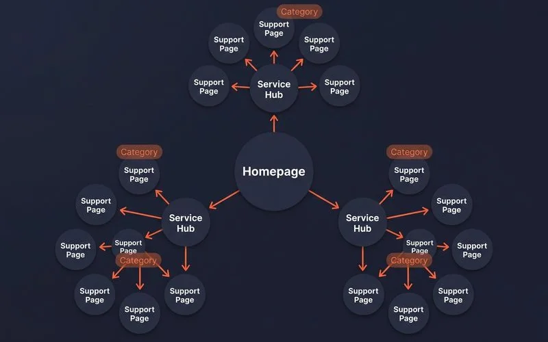
The pillar-and-cluster model is the most effective information architecture (IA) for building topical authority and achieving compounding SEO results. This structure involves creating a central “pillar” page for a major topic, like our 4-Stage Framework guide, and surrounding it with “cluster” pages that explore related subtopics in more detail.
This model creates a powerful internal linking structure. Pillars link down to clusters, and clusters link back up to the pillar and across to each other, signalling a deep repository of expertise to search engines. One case study showed this model can lead to a 279% increase in organic traffic within a year.
Three IA decisions to make in design are:
- Where the pillar pages will live. This is typically in a primary folder like
/services/{slug}/or directly at the root/{slug}/. For smaller sites, a flat structure is often sufficient. - Where the cluster pages will live. These usually reside in a
/guide/{slug}/or/blog/{slug}/directory, depending on the type of content. - How navigation surfaces both layers. Pillar pages belong in the primary navigation menu. Cluster pages are best surfaced through on-page links within your content and on a dedicated guide or blog listing page.
3. Set the performance budget in design
Core Web Vitals are confirmed Google ranking signals, and hitting their targets is far easier when the design process accommodates performance from the outset. A one-second delay in load time can reduce conversions by over 7%, so speed isn’t just an SEO metric, it’s a revenue metric.
Set these performance targets during the design phase:
- LCP under 2.5 seconds on mobile. Largest Contentful Paint measures how quickly the main content of a page loads. This target constrains the complexity of hero images, the weight of web fonts, and the overall layout of what users see first.
- CLS under 0.1. Cumulative Layout Shift measures visual stability. A low score here forces designers to specify
widthandheightfor images and pre-allocate space for ads or other content that loads late, preventing that annoying “jumpy” layout. - INP under 200 ms. Interaction to Next Paint, which replaced First Input Delay in 2024, measures how quickly your page responds to user interactions like clicks and taps. This target limits the use of JavaScript-heavy elements like carousels and complex filters.
- Total page weight under 1 MB on mobile. This hard limit enforces discipline around image optimisation, font subsetting, and the amount of JavaScript used.
When designers hand off a project without a performance budget, they set the development team up to build a slow website that will struggle to rank.
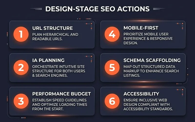
4. Mobile-first means design starts on mobile
Google’s mobile-first indexing means the mobile version of your website is now the definitive version for ranking purposes. This has three crucial implications for your design process.
First, you must design the mobile layout first and then adapt it for desktop, not the other way around.
Second, the mobile version of your site cannot have less content than the desktop version. Any content hidden on mobile is likely to be de-weighted or ignored by Google.
Finally, touch targets, like buttons and links, need to be at least 44 pixels square with adequate spacing to prevent accidental taps.
For businesses in Malaysia, this is non-negotiable. According to a 2026 report from Mordor Intelligence, smartphones account for over 72% of all e-commerce transactions in the country. Failing to prioritise a mobile-first design means you risk alienating the vast majority of your potential customers.
5. Schema scaffolding from the build
Schema markup, or structured data, is code that helps search engines understand your content more deeply. The schemas every site needs, such as Article on blog posts, FAQPage where applicable, and Organization on the homepage and About page, should be built into your website templates from the very beginning.
Adding schema retroactively often leads to incomplete coverage, where only a few templates get the markup, leaving gaps that are found in an audit six months later. A 2023 Search Engine Journal study found that search results with rich snippets like star ratings, powered by schema, can see a 35% higher click-through rate.
Plan these three things during the design phase:
- Which templates need which types of schema.
- Where the data for the schema will come from (e.g., frontmatter, a JSON file, or an API).
- How the schema will be validated using Google’s Rich Results Test before the site is deployed.
6. Accessibility as an SEO signal
Google has confirmed that accessibility signals influence rankings, primarily because they are linked to user experience. While there have been improvements, a study of Malaysian websites found that a high percentage still contained significant accessibility errors. Designing for accessibility isn’t just the right thing to do; it’s also smart SEO.
Here are three accessibility rules that also function as SEO rules:
- Use Semantic HTML. Use tags like
<nav>,<main>,<article>, and<aside>to structure your content instead of relying solely on generic<div>tags. This gives search engines clear signals about the purpose of each section. - Provide descriptive alt text for every image. Alt text is essential for screen readers used by visually impaired users, and it also provides valuable context to search engines for image SEO.
- Ensure interactive elements are keyboard-navigable. All modals, dropdowns, and accordions must be fully functional without a mouse, which is a core requirement of web accessibility.
Migration as a separate workstream
For any redesign of an existing website, migration must be treated as a distinct and critical workstream separate from the design itself. A poorly handled migration is one of the fastest ways to destroy years of accumulated SEO value.
Three assets must be delivered alongside the new design:
- A complete redirect map. Every single old URL must be mapped to a new URL, or the most relevant equivalent, using a permanent 301 redirect. One of the most common migration mistakes is mass-redirecting old pages to the homepage, which Google often treats as a soft 404 error, causing those pages to lose their rankings.
- An updated sitemap and hreflang configuration. These should be submitted to Google Search Console immediately after the new site launches to facilitate quick and accurate indexing.
- A post-launch monitoring plan. We recommend daily checks in Google Search Console for at least 30 days to quickly identify and fix any indexing issues or ranking drops.
We document more migration patterns and common pitfalls in our technical SEO audit checklist, which is essential reading before starting any redesign project.
What this looks like in practice
Our redesign projects typically run for 8 to 16 weeks.
The first few weeks are dedicated to the SEO audit, information architecture, URL planning, and setting the performance budget. Design work happens in weeks 4 through 8, while the build phase overlaps, running from week 6 to 12. The final weeks are focused on migration, launch, and meticulous post-launch monitoring.
This structured approach ensures that SEO considerations are woven into every stage of the process, protecting your existing rankings and setting the new site up for long-term growth.
Want a redesign that protects your existing SEO? Request a discovery call.
Quick Answers
Should I redesign before or after fixing technical SEO?
Will a redesign hurt my rankings short-term?
What's the right time to plan an SEO-friendly redesign?
Ready for the service?
Learn more about SEO Web Design
Web design and redesign engagements built around SEO and CRO from day one — URL architecture, page templates, Core Web Vitals, and conversion-optimised layouts.
Explore the Web Design Service